I 99eBooks è una directory di eBook. Cerchiamo e classificato intorno alle eBooks Web per te!
Tutti i diritti riservati. I libri e libri elettronici sono di proprietà dei rispettivi proprietari.
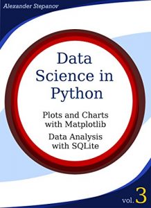
Data Science in Python. Volume 3: Plots and Charts with Matplotlib, Data Analysis with Python and SQLite (English Edition)
This volume describes data visualization with Python and using SQL database for data analysis. I assume you are familiar with Python 3, have scientific Python 3 distribution installed and know how to start IPython notebook that is used for all examples in this book. If you need help setting up scientific Python on your machine be sure to check out introductory volume 1 of this series. You might also want to look at volume 2 that deals with reading and writing tabular data, interactive data exploration with IPython notebook, GUI programming, deployment and high performance computations in Python.
Data visualization is one of the strongest points of scientific Python stack. Matplotlib library makes it easy to do both quick data exploration and creating publication quality graphs. It has ready made routines for drawing wide variety of plots, from classical line and bar plots to modern violin plots. It allows users to annotate plots or create novel plot types. Matplotlib's ability to export drawings in numerous graphic formats, including pdf, svg, animated gif or mp4 video makes it useful for interactive data exploration, web applications or drawing high quality diagrams. It is way more flexible than any GUI plotting software and will benefit any student's or scientist's tool box. This book is intended to get you started with Matplotlib.
SQL databases is a science of its own. Usually database is associated with data storage, but in this book I use it for data analysis. SQL is more expressive, clear and powerful than any spreadsheet application can ever be.
SQLite database is used for all examples. Python is used to load realistic bioinformatic data, but most of the queries can be run in GUI database management software you can download from the internet.
In a final chapter I combine Python, Matplotlib and SQL to solve a realistic problem - identify genes that are frequently mentioned together in scientific publications and draw a network showing how many papers mention each pair of genes.


